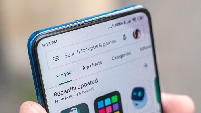
Google is now rolling out a new feature on its app store, the “Offers” tab at the bottom of the screen, after the Material You redesign for the Play Store. For most users, this will be the fifth tab, and the bottom may appear cluttered.
In the Play Store’s bottom bar, most individuals have four tabs. It increases to five if you subscribe to Play Pass. The default for all users may soon be five, with “Offers” sandwiched between “Apps” and “Movies & TV,” which is badly shortened in the process. It employs a regular price tag symbol and could result in a maximum of six goods, but in that scenario, Google is likely to move Play Pass.
If you’re curious about what the “Offers” page provides for users, it displays “Offers for apps you might enjoy” and “Offers for games you might like.” Each app and game in the Offers area has a carousel of larger-than-normal cover photos highlighting the deal and its expiration date, as well as conventional app information like the name at the bottom.
Despite the name, this is not the same as the “Offers & alerts” page in the app menu, and it’s more like the cards in the Games feed that advertise “Limited-time events.” It’s unclear whether this change would assist end users, but it will provide developers with a more visible surface than app listings.
While the update may not be noticeable to users aside from the UI, it will give app and game makers another place to advertise their apps as well as limited-time deals.
- Wear OS 5 Now Available for Older Galaxy Watch Devices - November 20, 2024
- Nick Martinez accepts the Reds’ qualifying offer of $21.05 million - November 19, 2024
- Apple Announces Next-Gen AirTag for 2025 with Enhanced Privacy Features - November 18, 2024

