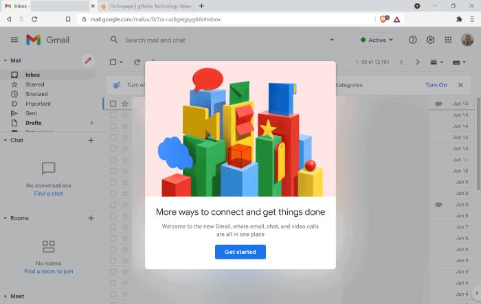
Google launched a new Gmail design earlier this year. The new interface is currently being rolled out to customers of the email service as the default option.
New Gmail design
The sidebar in the new Gmail design lets you move between Mail, Chat, Spaces, and Meet. You could note that the side panel for Gmail has vanished when you switch to the new layout. Fear not; it is still present. When you hover your cursor over the Mail icon, the classic menu will appear with shortcuts for your Inbox, Drafts, Sent, Bin, and all of your labels.
Every time you want to access one of the options, you might find it a little cumbersome to move the mouse over to the left. To permanently pin the sidebar, all that is needed to do is click the hamburger icon located above the menu. Similar to that, you may always collapse the menu for a basic experience.
Whether the menu is active or collapsed, the new Gmail View always shows the hover preview for other services. You can instantly access Chat while having Gmail open by hovering your mouse over it to get a list of your conversations without leaving the Mail window. Unread badges are supported by the sidebar icons to let you know when anything need your attention. You will notice a notification in the relevant service when a new message arrives. Some visual elements now have updated accent colours.
In terms of the Gmail experience, that is really all that has changed. The side panel on the right edge of the screen, which has shortcuts for Calendar, Keep, Tasks, Contacts, etc., is also the same as the rest of the UI.
Users will be able to select the apps that are featured on the sidebar by choosing Settings > Apps in Gmail > Customize, according to a Google support page. You don’t see the option, but users should be able to remove Chat, Spaces, and Meet from the side panel.
How to properly enable the new Gmail design
- Use the upper right corner of the page to access the Quick Settings window.
- Select “Try out the new Gmail view” from the menu.
- To switch to the new Gmail look, the website will ask you to reload the page. To update it, click the reload button.
For you, the new Gmail view should be available.
Not all users may have the option to switch to the new Gmail design just yet. It didn’t show up for me in Firefox, but it did when I used the Chromium-based browser Edge to view it. Therefore, you might want to try that if you don’t already have the new view, but YMMW.
The fact that the new Gmail interface is an opt-out experience and will be turned on by default is crucial in this situation. You can return to the original Gmail design by selecting it from the Settings menu.
There is an alternative method to restore the previous GUI if you don’t see that choice in the menu. Choose “see all settings” by clicking on the cogwheel. You may go back and forth between the original and new views using the first set of choices in the General section. To save the changes, click the save button at the bottom of the page. Since the new design is only now starting to be implemented, we may anticipate that this option will remain in place for a few more months before Google decides to discontinue it. This option was initially planned to be removed by the end of Q2 2022.
- How to Check IIT GATE 2025 Results Online? Complete Guide - March 19, 2025
- Deadmau5 Sells Song Catalog for $55M to Launch New Music Venture - March 6, 2025
- Japanese Girl Group F5ve to Drop Debut Album ‘Sequence 01’ in May - March 6, 2025


